Grayson Devlog (Week 6)
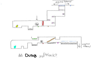
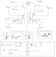
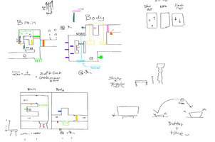
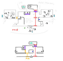
Approaching the 25% sprint goal, the team has made tremendous progress and we are on a really great pace to have a great end product. We all have made our own individual contributions to the development of the game. My role as creative director and level designer has been a blast so far and I have been quite satisfied with the work I've done
Level Design:
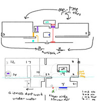
With level design, I struggled, and continue to still struggle to build levels that have a perfect balance of complexity and simplicity. Some issues I ran into in development were creating an engaging experience for both players 1 and 2 without overcomplicating the design of the levels. I have caught myself designing very complicated puzzles for areas of learning but was able to take a step back and make adjustments to simplify it for the sake of learning a new mechanic. I still don't think I have mastered this balance yet, but once we begin playtesting, I think I, along with the other level designers, will have a better idea of what is reasonable for each level.
Another challenge that I mentioned has been balancing player engagement. If a player is the "control player" while the other has the more engaging role of platforming, there should be enjoyment in both roles. Some ways I have tackled this is by having the control player have a more active role in the puzzle, such as precisely moving a platform to weave through hazards, using one gizmo (the controllers that players are given are called gizmos. Fun, right?) to control multiple on-screen components, having a control affect both players, etc. As we playtest, we can also figure out what is fun for players and incorporate more of those elements into the levels
The last major issue I've run into is preventing soft-locking, or major backtracking without giving away puzzle solutions. One feature of our game is the resource management of your gizmos. If you're given one switch and one crank, they can only be placed in one place at a time. Because of this, levels can soft lock players by locking them away from a gizmo left behind, or force players to redo puzzles they've already done for a gizmo that they SHOULD have taken. The solution to this shouldn't be to force the player to backtrack a super long time, or to create a new hazard to force them to take a gizmo; the solution should be to design the level in a way that gives the player an easier way back, or to tell the player that they need the gizmo sooner. The way that has worked for me is compacting the level. Rather than having a linear progression, having a space that unlocks new things to interact with as you move forward solves these issues. This design also has its own setbacks though, such as being too overwhelming, which can drive a player away from the level
As I've been designing for Level 1 and beginning on Level 3, I learned that the best way to design is to just start making something and do not be discouraged if the design doesn't work or if you have to restart. I've already scrapped fully-made puzzles just because they fell too far into one of the pitfalls stated above. Upon restarting these levels, I took aspects that I enjoyed from the prior iteration and put them into the newer version and settled on a better product.
Overall, while level design has taken a huge chunk of my time in development, I think the lessons that I'm learning through development are helping me create new levels.
Art:
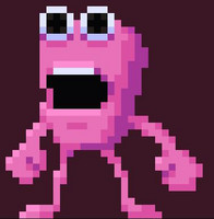
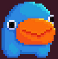
For character designs, they were based on the gameplay for our prior core gameplay loop before we switched. This old gameplay loop was one player controls platforms, and one player does the platforming. Because of this, one character has limbs, the other is just a blob. The designs after the change were still liked by the team, and I think the dynamic of a loud lanky pink man and cute blue goo ball work well together
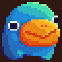
Environment design has been primarily Elisa's work, and for this, she and Tolu were tasked with moldboard creation. What we settled on is a color-blocked style versus a super smooth shading style. We will have cool shadows and warm lights. This will be a constant throughout all of the art done in the game. In the newer iteration of the Blue character (no name yet) you can see the warmer light and darker shadow showcased.
We are still pretty early on in the art stage, but we are playing around with what styles can look good in our levels and we are finalizing a feel
Overall, I think the team is doing great and we will have more great content to show as we continue creating
Get Spit It Out!
Spit It Out!
| Status | On hold |
| Authors | William Baran, Sarah Reen, gjones50, JazzyJems, A. Weis, SEGAGENESISDOOD |
| Genre | Puzzle, Platformer |
| Tags | 2D, Co-op, Pixel Art, Short, Unity |
| Languages | English |
| Accessibility | Subtitles |
More posts
- Andrew Weisberg - Week 15 DevlogNov 30, 2023
- William Baran - Week 15 DevlogNov 30, 2023
- Tolu Kolawole - Week 15 LogNov 30, 2023
- Sarah Reen - Week 15 DevlogNov 29, 2023
- Elisa Kucalaba - Week 15 DevlogNov 29, 2023
- Sarah Reen - Week 14 DevLogNov 22, 2023
- Tolu Kolawole - Week 14 LogNov 22, 2023
- Elisa Kucalaba - Week 14 DevlogNov 22, 2023
- William Baran - Week 14 DevlogNov 21, 2023
Leave a comment
Log in with itch.io to leave a comment.